Release 20131126 - fluid UI
December 03, 2013 in bliss by Dan Gravell

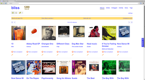
This release contains a nice enhancement; the album overview (and other pages) are now drawn in a "fluid" style. This means the more you widen the page, the more that is accommodated. Before, bliss would always show four albums on each row of the album overview. If you have a wider browser this can now grow and grow!

This is also adopted on other pages such as the change cover art page. It makes better use of modern high resolution displays, so I hope you like the change.
Other stuff
Some more minor changes and tweaks...
- OneMusicAPI is now used for genre and year lookup
- Cope with files with spaces at the start of the name
- Avoid certain memory usage problems in bliss's index of tags
Downloading and installing the latest release
You can download the release from the downloads page. After you click through, installation instructions are available on the page following download.
Existing users can use the in-app updater. You can also download the latest installer and install it, replacing the current installation. Any fixes licences already purchased will be retained!
Thanks to Kenny Louie for the image above.

