Work in progress: a new settings page
August 07, 2018 in bliss by Dan Gravell

Over the coming weeks I'll be refocusing on making bliss a bit more understandable for new users and existing users alike. We've implemented a few smaller improvements, but the first big piece of work is a redesign of the settings page.
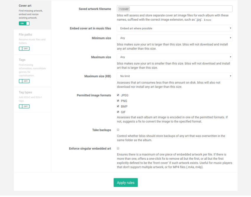
The current settings page is functional and... exhaustive. To many new users the initial 'blast' of settings, text, controls and help information to digest is overwhelming. To existing users, making changes to their rules is more work than it needs to be; too many clicks, too much scrolling, too much thinking.

The goals when improving the page will be:
- Make the settings page initially more comprehensible.
- Upon first use provide a clearer sequence of buttons-to-click.
- Make finding and enabling rules easier.
- Don't clutter the UI with information that isn't required.
The solution will be a change in the structure of the settings page.
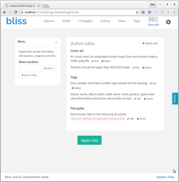
Instead of showing all of the possible settings, initially only the current active rules will be shown. If there are no active rules, a helper "call to action" will provide a shortcut to add a rule.

The active rules will be thinned down to only those that are being used. For example, if the minimum size artwork rule is enabled, but not the image format rule, only a description of the minimum size rule will be shown.
Each active rule will be editable and deletable. Editing the active rule for, for example, the minimum size rule will allow the minimum size to be changed and automation to be enabled/disabled.
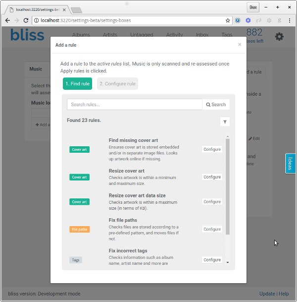
Adding a rule is performed separately. A button to add a rule is clicked and an in-browser popup allows rules to be browsed and (eventually) searched. From there, a rule can be selected, configured and from there it is added to the Active rules list.

Hopefully this achieves our goals:
- There's less of an overwhelming amount of text on first use.
- A blank slate button on first use directs the user straight to add a rule.
- Rules are not hidden behind tabs, and can be searched by name.
- Rules don't have to be separately activated (the current ON/OFF buttons).
- Rules are treated individually so less irrelevant stuff is shown on screen.
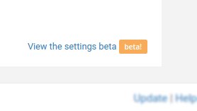
I'm building an ability for existing users to check the progress of the new settings page. I'd love your feedback! From the current beta and the next release (next week) there is a link to the right of the Apply rules page to view the current state of the beta. So let me know what you think!

Thanks to Alice Achterhof for the image above.

